HomeLife Zhongshan
Helping Zhongshan evolve into a more lifeable city
Brand Concept and Narrative
Brand Naming
Brand Identity and Visual System
Brand Experience Design
Brand Engagement

Design partners ——
Jess and Jin
It was a bright ambition, our objective was to determine the unique opportunities to strengthen Zhongshan’s competitiveness among the region, and elevate its cohesive power, city image and reputation.
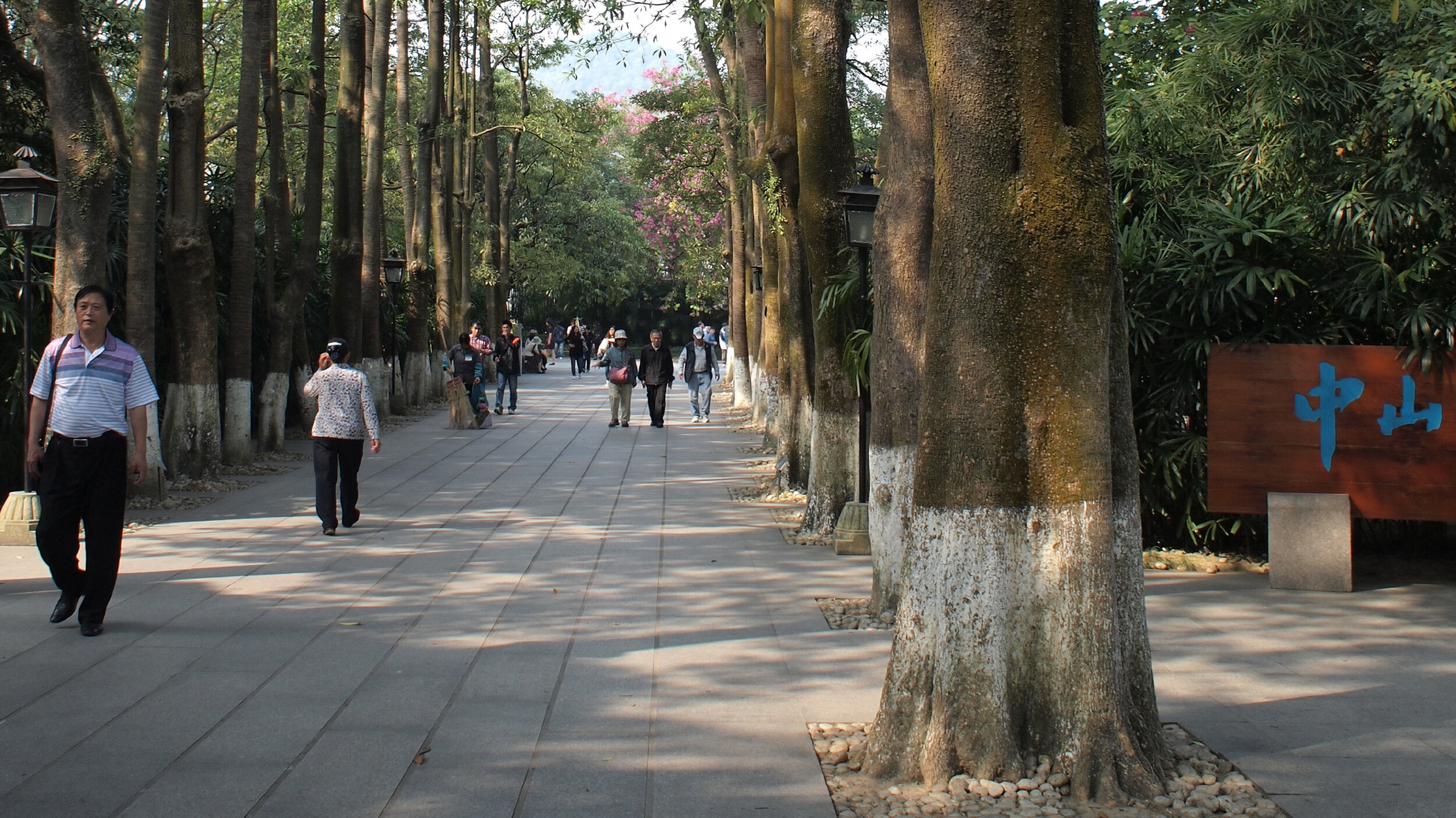
/ Visiting Zhongshan in the autumn of 2010 to meet the brand team of the Zhongshan city government, as well as the management of major local industries
On our strategic and design proposal, we have explored the possibilities of “Bridging”, both internally and externally. Internal Bridging suggested the connection between the Zhongshan government, the towns, the industries and its people, while the external Bridging concerned Zhongshan’s connection with other entities, the rest of the nation or even the entire world.
Bridging has the common meaning of cohering, networking, bonding, connecting, linking and engaging. But in our case, Bridging was an invigorating engagement programme for Zhongshan people and the city with the help of its industries, we have accordingly named it HomeLife Zhongshan.
In fact, our concept was all about home and people life in Zhongshan. However, the word “Home” is not only represents a home, a house or a family, it also represents Zhongshan is a biggest home of its people, its towns and its industries.
The lead thought of our concept was to demonstrate how Zhongshan connected to every aspect of living, linked with every home’s slice-of-life, and expressed the values its people believed in.
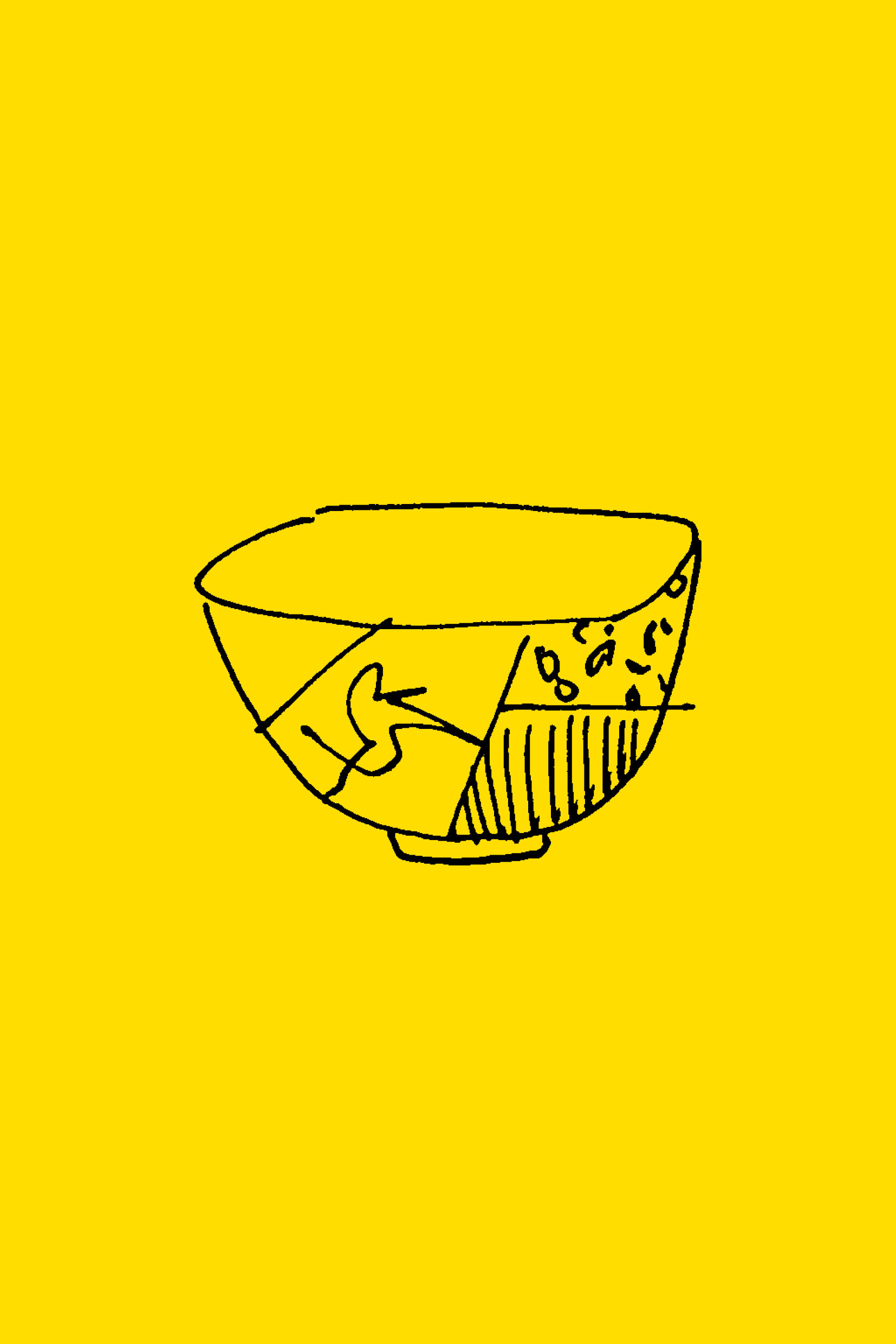
The design behind the brand identity of HomeLife Zhongshan is actually a bowl of soup, we believe it can symbolize the homey feeling and it is also a container that can contain many things, even filled with a bliss life, a design life, a nature life, etc.
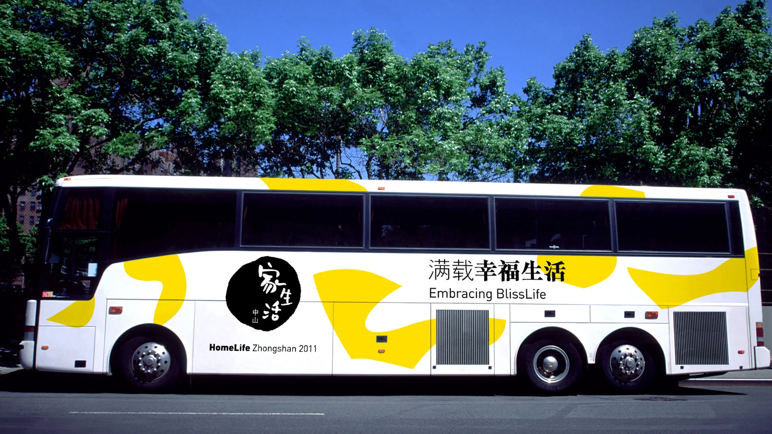
In addition, the secondary graphics came from an idea of the ripples in the soup with how it blended. Yellow was chosen as a brand colour, inspired by Zhongshan city flower — chrysanthemum.
/ Designing an entire user journey (preliminary thought)
We have then created a flexible yet coherent brand visual system in order to better facilitate the brand communication throughout the entire HomeLife Zhongshan engagement programme, and the concept was well demonstrated across the whole user journey by some significant design applications.
/ Demonstrating the touchpoints of the journey, which utilized the brand visual system (supporting graphics)
/ A thematic magazine featuring the “lifeable” concept
/ Unveiling the beauty of Zhongshan and its most renowned industries in an experience house (art gallery)
/ Engaging Zhongshan people to share their unique stories in the programme
/ Travelling the city easier by community bike-sharing
/ Some visuals shown here are for design reference only, the image rights belong to the corresponding sources


