Hirosaki Apple
Rejuvenating the apple city image of Hirosaki
Brand Concept
Brand Architecture
Brand Identity and Visual System
Brand Experience Design

An apple is not only a valuable asset of Hirosaki, it is indeed a unique identity of the city. Our aspiration here is to help Hirosaki to rejuvenate its city image by reinforce its brand personality, in order to gain broader city recognition among the region, and the world.
Shift + Shape
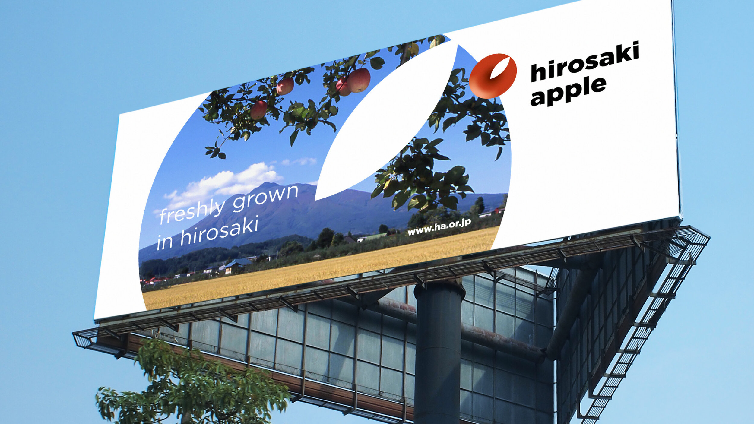
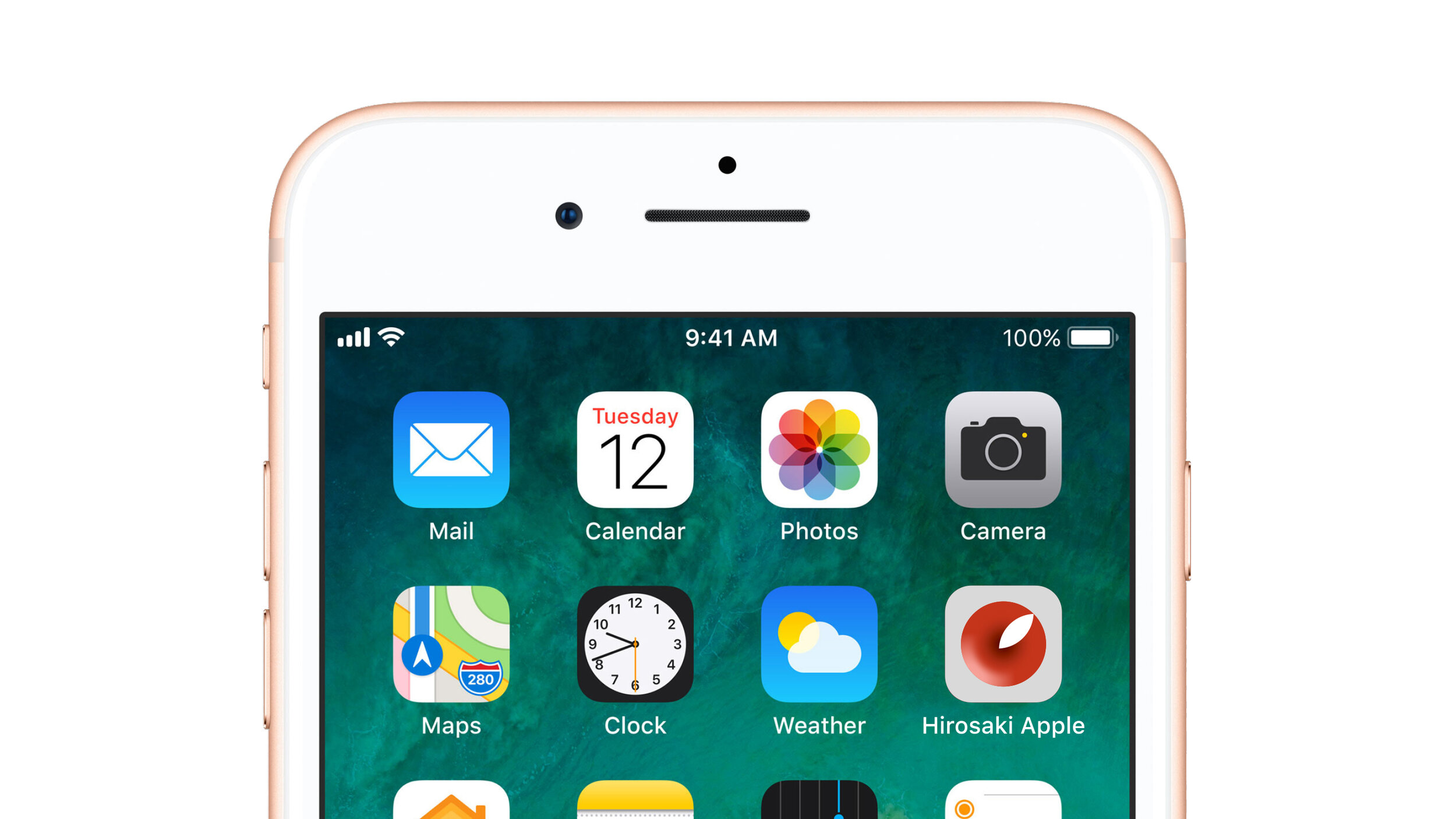
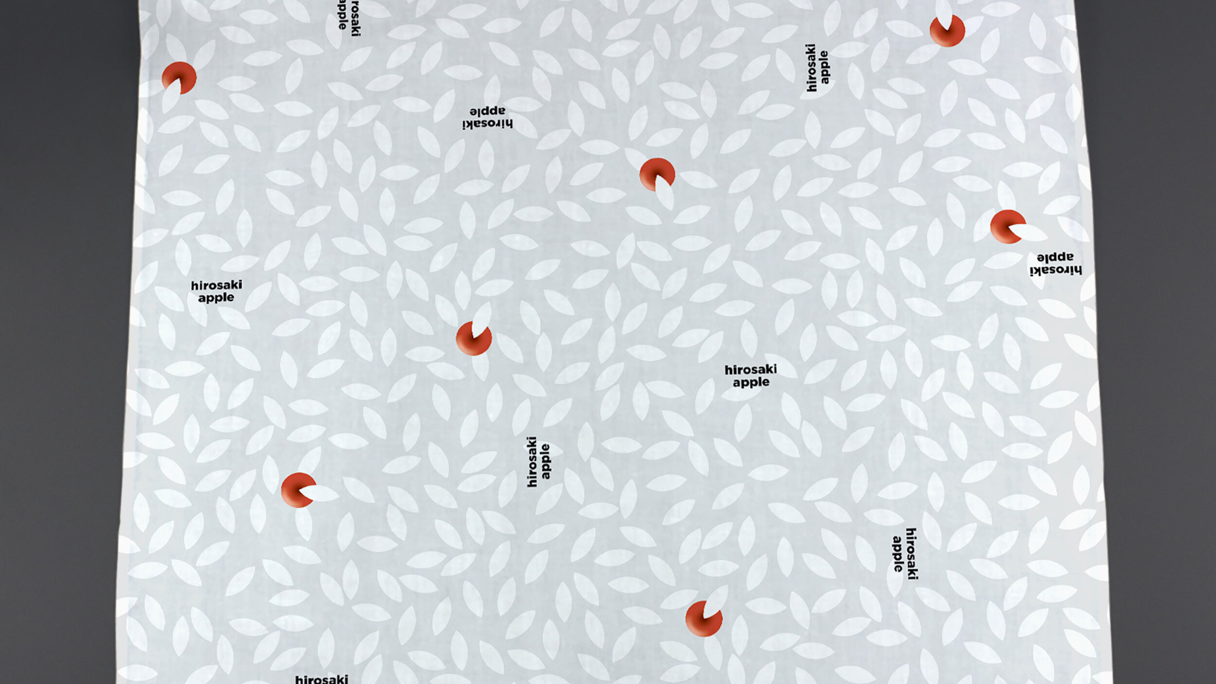
We created a new apple icon for Hirosaki in the autumn of 2017, unlike any other typical apples, our idea was to look at an apple from the top, this has led the brand identity design to a much simpler but more significant direction.
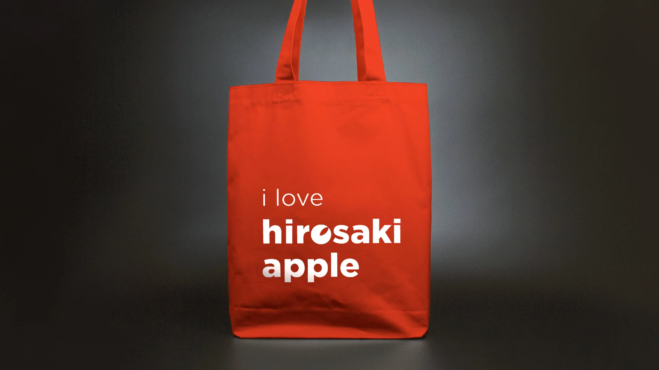
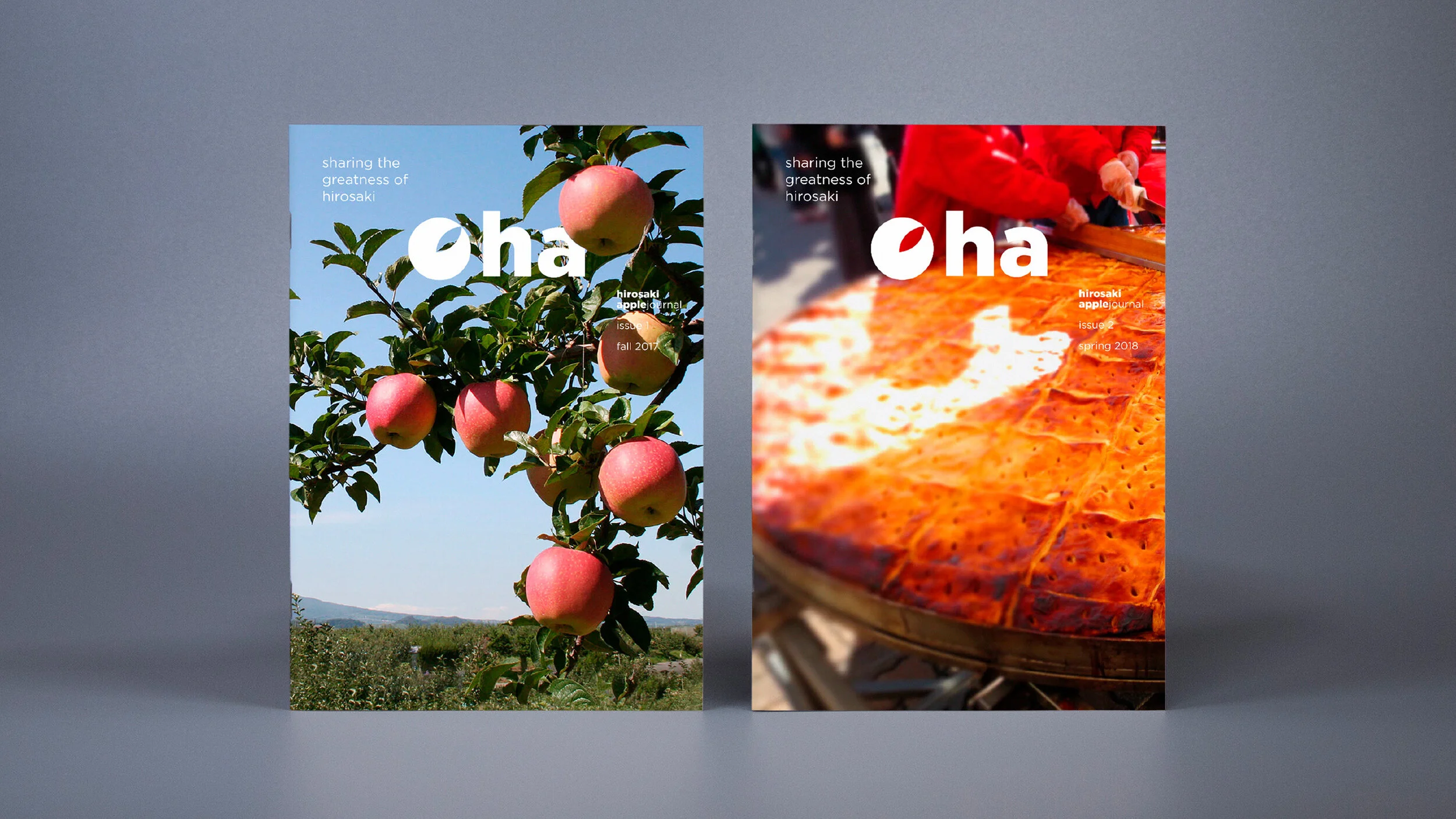
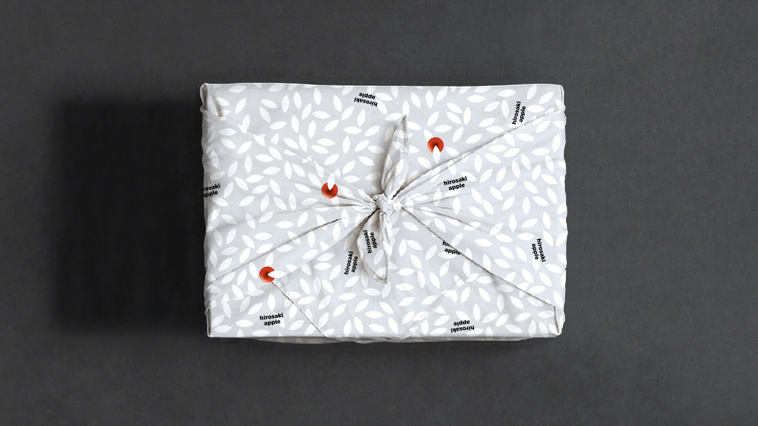
And besides, a perfect round apple along with a geometric form of leaf are two core elements of the brand visual system, they have been fully utilized in various applications as a series of branding design for Hirosaki Apple, from outdoor billboards to packaging, from name cards to signage, etc. As a matter of fact, this is a bold, sharp and ingenious system for the new Hirosaki Apple brand to better express themselves, and stand out from their peers.
Build + Bond
In addition, we conceived a coherent and cohesive brand architecture for Hirosaki Apple, which can help them to more easily manage the relationship between the offerings by Hirosaki, for instance, Apple Park and Apple Fest. This monolithic branding approach can make high impact at the launch, provides flex, stretch and persistence for the future as well. On the other hand, we proposed to establish a social fund to support different kinds of local development, particularly for education. We think it is a significant value of Hirosaki Apple brand, and also one of the core mission on their brand building journey.
Chance + Choice
The interconnection between an apple and Hirosaki has provided us this great opportunity to come up with a holistic city branding design solution for Hirosaki, although this was only a design competition project (organized by designboom, in collaboration with Hirosaki Design Week and Japan Design Week). However, the apple as a big concept and an unusual gift for Hirosaki, it has tremendous potential to further develop. We believe we have unfolded a new chapter for Hirosaki Apple, this is most certainly a challenging but thrilling adventure for all of us.
/ Demonstrating Hirosaki Apple’s brand identity along with its lively yet coherent visual system
/ Some visuals shown here are for design reference only, the image rights belong to the corresponding sources
